Let me explain, again. Yes, I know I sound like a broken record, but the facts don’t lie. Last week, in my commentary that I am not willing to admit that I’m wrong, I explained the fundamental reasons why the market is due for a crash. My reasons included:
- No jobs;
- The Baltic Dry Index is tanking;
- Government deficits continue to increase;
- Oil continues to explode into the Gulf;
- Real estate prices are plummeting;
- An Israel-Iran war looks inevitable, perhaps around the July 11 time period; and
- Gold continues to make new highs, revealing investor’s flight to quality.
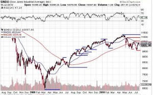
On that basis, I lightened up the stocks in my portfolio, and moved more into cash. This week, let’s look at the charts, because the charts don’t lie either. To quote the immortal philosopher Yogi Berra, “You can see a lot by looking.” So let’s try looking, shall we? Here’s a chart of the Dow over the last two years:
As you can see, from the bottom in March 2009 until the top in May, 2010 the Dow made a series of higher lows, and higher highs (as indicated by the blue lines; click on the chart to enlarge). It doesn’t take a genius to understand that the markets are going up when lows are higher, and highs are higher.
(As an aside, I’ve been expecting the market to correct for over a year now, so why I couldn’t see this simple pattern obviously proves that I’m not a genius, but I digress).
From the top in May to now, the markets have made a series of lower highs, and lower lows, as indicated by the red lines. That clearly indicates that the market is dropping.
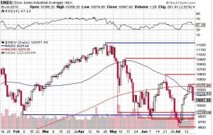
Here’s a chart of the last six months:
It’s quite obvious that we are in a pattern of lower highs and lows. It will also be obvious when we break out of this pattern. We had a great week, until Friday, and many were ready to proclaim the start of a new bull market. Obviously that was not the case, and Friday’s action proved that it’s a lot easy to go down than up. Friday’s drop of almost 3% was easily enough to wipe out a week’s worth of gains.
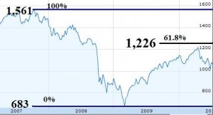
The Dow is not particularly representative, so let’s cast our gaze instead on the S&P 500 index. You will all recall the Fibonacci retracement chart I posted when back on March 27 I wrote about Gold Heading Higher, Market Heading Lower?, and I showed this chart:
The S&P 500 had peaked at around 1,561, and then dropped to around 683. A bounce back by 61.8%, which is a key Fibonacci level, would bring the market back to somewhere in the range of 1,225 to 1,230, depending on the exact data points you use. My point then was that to confirm the rally and demonstrate more conclusively that the new bull market had begun we needed a close on the S&P of around 1,230 We got close, but then that was it.
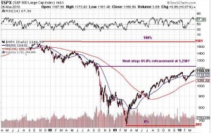
Let’s update the chart, shall we?
You can clearly see where the market got close to the key Fibonacci level, but pulled back, and hasn’t gotten close since. This ain’t no bull market, my friends.
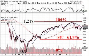
Want a different perspective? Here’s the S&P 500, but let’s look at it in reverse.
The rise from 683 on March 6, 2009 to 1,218 on April 23, 2010 is the 0% to 100% gain. A pullback of 61.8%, a key Fibonacci retracement level, would pull us back to the 887 level. It may just be coincidence, but on July 10, 2009, a mere 53 weeks ago, the index closed at 879.
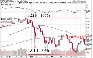
And yes, you can do an even shorter term chart, and get similar results:
So, to summarize:
We are not in a bull market. Not even close.
The market blew through the 1,092 on Friday, confirming the down trend.
If the market can’t hold in the range of 879 to 887, we’ve got really big problems; that will be a big break to newer lows.
It would appear that the next level to watch for on the S&P 500 is the support level of 1,014 established intra day on July 1, 2010. That’s only 50 points away from the close on Friday, and since Friday was a day when the market fell almost 32 points, it may be this week when we find out if that level will hold.
I have lost money on the SP 500 Index puts that I bought over a week ago, but that’s fine. I’m not playing with big dollars, so at this juncture I am peace holding cash, and some puts, and a small selection of precious metals stocks. I can sleep well at night, provided I don’t think too much about these charts.
More down than up is in our futures, I fear.
Thanks for ready, hold cash, and see you next week.
{ 1 comment… read it below or add one }
Seems to me the lows of Nov 2008 – March 2009 were an abberration that should be excluded when using chart analysis. I sense that margin calls accounted for much of the carnage and many stocks were selling for half of companies’ book value, which was insane. Take a look at various stock message boards and one can see lots of activity in 2008, and nothing since in a lot of cases. The relative absense of the retail investor today, easy money policy, and good earnings should prevent a market crash IMHO. Thank you VERY MUCH for posting great content every week though.
You must log in to post a comment.